Dog dribble, Spaghetti Bolognese and a council minute book: pure beauty?
Isn’t it funny how some people find certain things attractive, yet to somebody else, the exact same thing doesn’t do anything for them. Beauty, as the saying goes, is in the eye of the beholder.
For example, some people would look at a growling, floppy-jowled, saliva-dripping bulldog flashing fangs as sharp as razorblades and would think it’s as cute as a new-born kitten.
But there are some people who would run away extremely fast because they believe they’ve just come across an evil beast from the deepest pit of doom.
I shall let you guess which category I fall into, but here’s a clue: I’m not a fan of dog dribble.
It’s the same with virtually anything – art, movies, sport, food. You name anything and someone will like it just as passionately as the next person dislikes it.
Spaghetti Bolognese for example. Some people’s eyes pop out of their heads with glee when they see it on a menu in a café or restaurant, whilst others cannot stand the awkwardly stringy, overly floppy, sauce-flinging laces of pasta that will just not stay on the blasted fork, spoon, chopsticks, fingers or whatever implement is chosen, without permanently staining everything within a half mile radius with the sauce of shame.
I shall let you guess which category I fall into, but here’s a clue: if you see a spag bol in front of me, it would be wise to give me half a mile of clearance.
There is one particular thing that I find rather good to look at that not many other people do though (although I’ve never really asked, so maybe people do?) and it’s this: a page of text.
Not just any text though, but specifically a double-page spread from a book that has been classically typeset with quality and care.
That may seem a very odd thing to find attractive, but I should mention that many hundreds of years ago when I left school and went to college, I was taught how to design and typeset a range of things, with books being one of them. And it’s amazing how many books I’ve seen since then that don’t correspond to those same classical standards.
This, to be fair, is mainly down to the various publishers wanting to maximise their profit margins by printing as many words on a page as possible without it looking a mess or unreadable. And in a way, it saves paper, so that can only be a good thing.
So when one does spot a rare book that has been well typeset, it’s a thing of beauty.
A good example of this is a highly unusual – but lovely nonetheless – council minute book from Stroud Urban Council that I came across in the archives the other day.
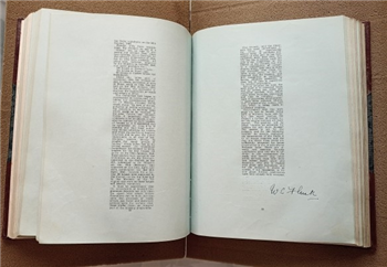
[Doc ref: DA16/100/21, Minutes of Urban District Council, 1943-1948]
(I do realise I’ve used the words “lovely” and “council minute book” in the same sentence there. This may be a first for humanity, but bear with me.)
The most striking thing about it is the generous, almost obscene, amount of white space being used as margins on each page. Just by looking at it I can hear the distant voice of my ex-tutor enthusiastically spouting one of his regular tips: “Never underestimate the power of white space” in a design.
It’s an extreme form of the large-margin theory, which is why I spotted it, but I still think it’s marvellous.
For me, it doesn’t matter what the words actually say, it’s the fact that there are clear, crisp, well-defined boxes of text, properly and (in this case) harshly justified with only a smattering of line-splitting hyphenations on such a narrow column of text.
Add in those outrageous margins that act as a natural picture frame (presumably for plenty of note taking and amendments), a dose of precisely calculated symmetry and it looks like a work of art, complete with signature.
I find, as with most artworks and paintings, the trick to appreciating these pages is to look at them from a distance so you can’t read the text. Only then will the eye gloss over what the page is trying to tell you and instead hone in on the aesthetic beauty of the design.
But out of interest and for fans of information, the pages in the photo above shows that the groundworks of the housing estates around Foxmoor Lane in Stroud were prepared in 1945 by prisoners of war.
Some people might look at a painting by Picasso and feel as if they should hang it on a wall to admire it. Whereas some other people would prefer to frame and hang on their wall a double-page spread of classically typeset text instead.
Some might even get greater enjoyment out of that than anything by a Spanish cubist artist, even if it was a painting of a dribbly dog eating Spaghetti Bolognese.
I shall let you guess which category I fall into, but here’s a clue: I’ve just written a blog piece about the beauty of printed text.
Anthony Phillips, Archives Assistant
To read all the Blogs visit Gloucestershire Archives (wordpress.com)